Why shoppers were dropping off Nordstrom's styling-appointment booking, and the fixes now live.
Nordstrom's personal styling booking flow had a documented high drop-off rate. Working with Nordstrom's UX Research team, we ran think-aloud usability tests to find out why. Four changes tied to our findings have since shipped on the live site.
- MY ROLE
- Usability research, synthesis, design recommendations + follow-up mockups
- TEAM
- 4 researchers, with Nordstrom's UX Research team
- TIMELINE
- 10 weeks · Winter 2024 · UW HCDE 517
- METHODS
- Screener survey, think-aloud usability testing, affinity synthesis
- TOOLS
- Zoom, Figma, Google Workspace

01 · WHAT SHIPPED
TRACKED ON THE LIVE SITEAfter the project, I tracked Nordstrom's booking flow. These changes, each tied to one of our recommendations, are now in production. Some match what we proposed directly; others took a different route to the same problem.
Premature confirmation page removed
Replaced by a running appointment summary that stays visible through the flow, so shoppers no longer think they're done before choosing a time.
Back-button bug fixed
Going back now returns to the previous step instead of dropping shoppers at service selection and losing their choices.
“Additional information” page reworked
The confusing style, size, and budget prompts became one optional field at the final step. A different approach than ours that resolves the same problem.
New “Services” tab in the main navigation
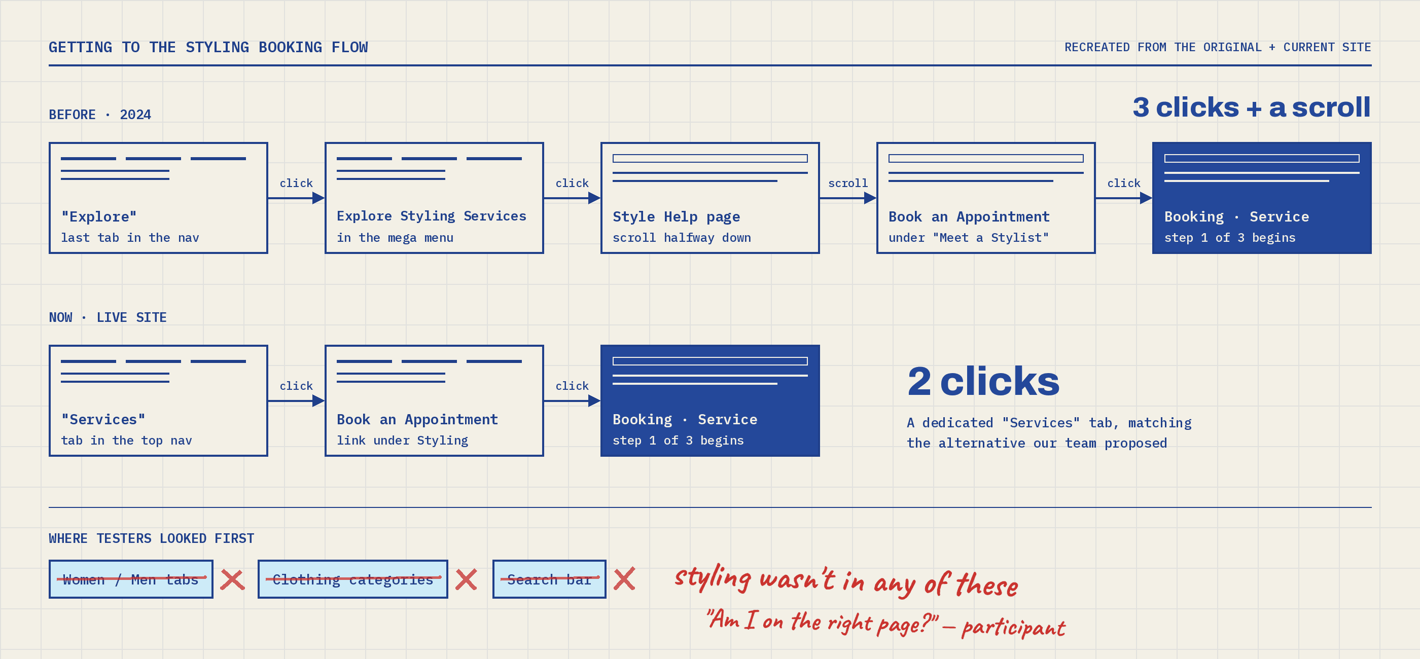
Personal styling is now easy to find. Nordstrom chose the alternative we proposed, a dedicated section, over placing it under the gender categories.
02 · THE PROBLEM
Nordstrom lets customers book in-store personal styling online, but the booking flow had a documented high drop-off rate.
With the project sponsors' approval, we focused on one group: people interested in personal styling. Participants were over 18, had shopped at a similar store, and were interested in styling services.
RESEARCH GOALS- Understand why users drop off
- Understand whether the styling feature is hard to find
- Identify the specific friction points in the flow
03 · THE RESEARCH
SURVEY → THINK-ALOUD SESSIONSA screener survey found the right participants, then remote and in-person think-aloud sessions showed us where the flow broke down.
MY PART: helped design the screener survey, ran usability sessions, and led parts of the data synthesis.
04 · WHAT WE FOUND
3 FRICTION POINTSEvery participant hit at least one of these. Together they explain where and why shoppers were dropping off.
Shoppers couldn't find styling at all
From the nav bar and clothing categories to the search bar, participants couldn't find the booking page. Styling services lived under categories that weren't obvious and required jumping to new pages.
Am I on the right page?PARTICIPANT

The “Additional information” page stopped people cold
After entering their details, shoppers faced a full page of open-ended questions. Describing their own style, picking sizes without guidance, and choosing from budget options that started too high all caused friction.
If there was a way to put photos of clothes I would wear instead that would be great because I don't know what the nomenclature is.PARTICIPANT


The flow's navigation worked against people
A confirmation screen appeared before shoppers picked a date or time, so they thought they were done. And going back to change stylists dumped them at service selection, losing their progress.
That page felt like it was final, so I expected to see the time I was going.PARTICIPANT


05 · RECOMMENDATIONS
4 CHANGES, MAPPED TO WHAT SHIPPEDEach recommendation targeted one friction point, and each was scoped to be realistic for Nordstrom's team to implement.
06 · MY FOLLOW-UP CONCEPTS
SOLO WORK · NOT PRESENTED TO STAKEHOLDERSOur team delivered written recommendations. Afterward, I mocked up how the “Additional information” fixes could look.
Pick your style visually
Image-based options so shoppers can point to what they like instead of describing it in words.

Sizing with real guidance
Brand- and item-specific sizing help, or the option to enter exact sizes.

Flexible budget options
Let shoppers enter their own budget, or offer a wider range that starts lower.

07 · REFLECTION
Working with a real company on a live product was the most rewarding part of this project. Seeing our research turn into actual changes, not just a grade, made the constraints worth it. Thank you to Nordstrom's UX Research team, especially Angela Sharer and Hannah Nursalim, and to my teammates Alisha Mudbhary, Jinzhao Chen, and Purva Tekkar.